Get Video Editing Tips, Tricks, and Guides Straight to Your Inbox
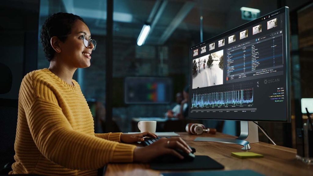
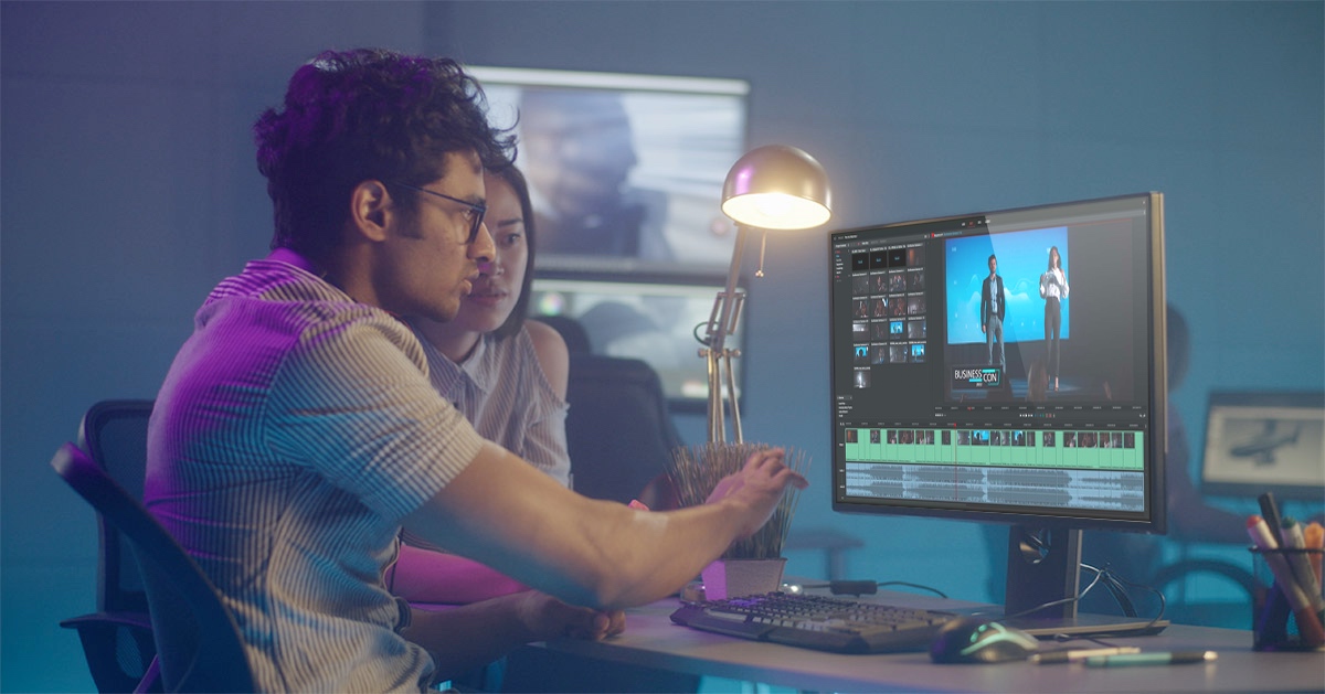
Not everything can be fixed in post, but some things can be, like the colour. Scopes can be a complex area of the editing workflow, especially for those without formal training. This guide will give you all the information you need (and some of the more advanced information too) to help create perfect, pro-level media content.
Human eyes are wonderful – but the things that make them wonderful also make them unreliable. They react and adapt to the things we see, handling bright sunlight and the dark of night better than any camera, but it means that our impression of the world is constantly changing depending on what we've recently looked at.
Scopes tell us things about the picture in absolute, numeric terms, helping us avoid inconsistency between shots and scenes, distracting jumps in brightness and colour that are easy to miss if we rely on nothing more than looking at a display.
We can help the human visual system better by calibrating the monitor and controlling its environment. Placing a neutral, often grey background behind the display, controlling the decor of the room and the colour temperature and lighting quality will help. Although anyone moving from grading a pitch-black night scene to one set in a very bright noon sun might still see the sun as unusually bright. Perhaps that's useful if that's the order of scenes in the production, but it's still a good idea to compare how bright something looks against how bright it mathematically is.
Colour is even more complex: studies have shown that humans can't generally match two identical colours from a set of similar colours after looking away for more than a few seconds. Comparing things side by side is always helpful, so grading applications can often do that. Still, it's not usually practical to compare every scene in a production with every other scene, so scopes remain key.

Histograms are among the simplest scopes, both to interpret and for the technology to generate. They have long been found on cameras as an exposure guide, where their simplicity doesn't demand too much of the camera's limited hardware.
A histogram is simple: darker pixels are represented at the left, and brighter pixels at the right. More activity on the right-hand side of the display suggests a picture containing a lot of bright pixels, while activity on the left indicates a lot of dark pixels. A completely black picture is shown as a single column on the left edge; a completely white picture as a single column on the extreme right. This makes histograms a good indicator of overall exposure.
Many images will have a lot of midtones, so the histogram peaks in the middle unless the scene is deliberately very bright or dark. Conversely, a histogram with most of its activity clustered at the left side is likely to be underexposed and gloomy, with a risk of introducing noise when corrected. One with activity clustered at the right is expected to be overexposed and bleached out.
A limitation of the histogram is that it doesn't tell us anything about which parts of the picture are causing which features of the graph. Bright pixels anywhere in the image will be indicated on the right side of the histogram. The other limitation is that the vertical axis, which shows us how much of the image is at a given brightness, is limited in size. If a large amount of an image is all at the same brightness, the peak on the graph may be taller than the display area for the histogram, potentially giving an inaccurate impression of the image's exposure.
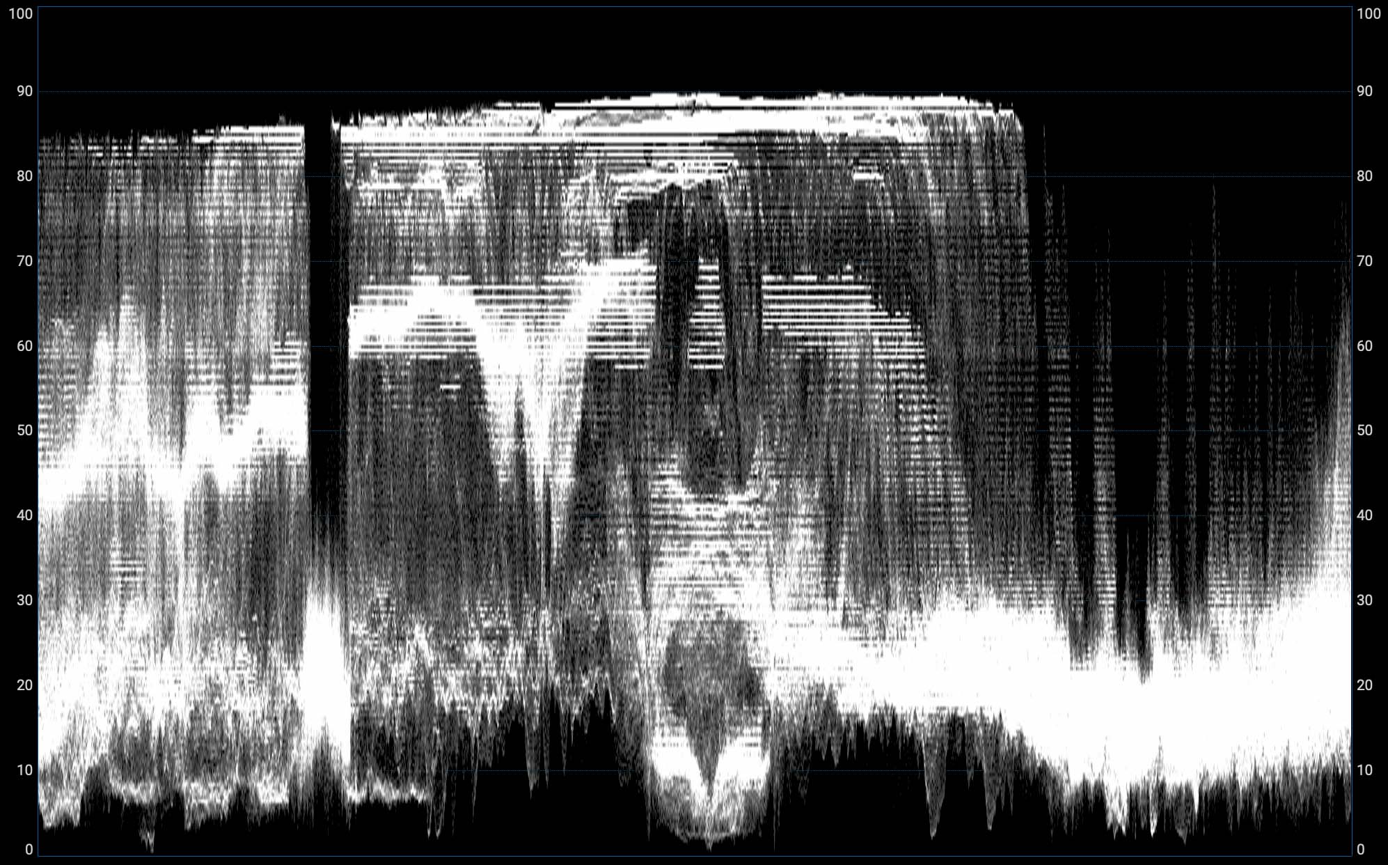
Waveform displays are based on a traditional piece of test equipment used since the dawn of television. They give us more information about where things are in the image than a histogram, although they can be slightly more challenging to read.
The easiest way to understand a waveform display is to think of a single row of pixels taken from an image. If we draw a graph of the brightness of that row, the horizontal axis of the graph represents the position in the picture, from left to right, while the vertical axis represents brightness. Some waveform displays have a single-line option that works exactly like this and lets us examine the brightness of any row of pixels in the image.
A conventional waveform display does this for every row of pixels and adds all the rows together on the display. The result is a semi-transparent composite that can tell us about the image's brightness. The right side of the picture will be drawn on the right side of the waveform. Bright objects are drawn toward the top of the display, with darker objects toward the bottom of the display.
Waveforms are very common as exposure tools used in live broadcast TV and post-production. They're particularly good at warning about overexposure, which appears as the waveform becomes compressed against the upper edge of the display. In post-production, they can be beneficial in controlling black levels to ensure shadow detail isn't crushed. If the lowest details of the waveform display are significantly above the baseline, for instance, shadows may appear foggy or lacking in contrast, with no true black in the image.
They're also very good at spotting specific control problems. Noise is visible as a vertical twitching motion in the waveform, and banding caused by inadequate bit depth or excessive brightening of an underexposed image can become visible as horizontal stripes in the waveform.
Waveform displays descend from physical test equipment of decades past, which used CRT displays with a horizontally scanning beam to draw them. By making the video signal deflect the beam upward as the image gets brighter and scanning horizontally once per television scanline, a waveform display is illustrated in real-time. Perhaps paradoxically, they're much more complex work for a computer, which must evaluate the brightness of every pixel in an image and add brightness to the specific areas of the resulting waveform display.
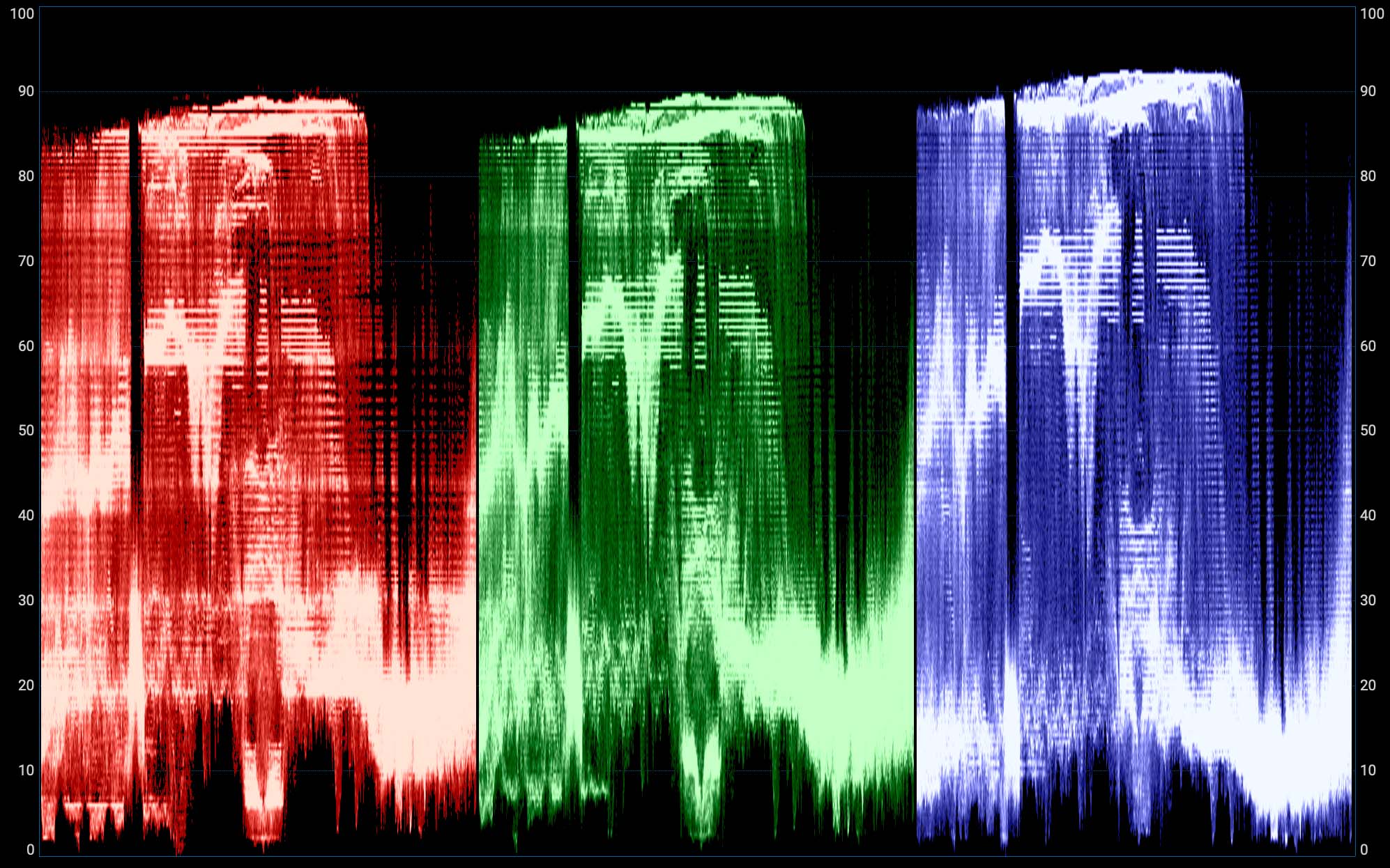
Conventional histogram and waveform displays deal only in brightness. Either can also be used to display colour information, perhaps most often by superimposing separately-generated scopes representing the image's red, green, and blue channels. This means that neutrally-coloured objects should appear as white features on the waveform, while the pale blue of a sky should be visible as a large peak in the blue and (to a lesser extent) green channels.
This can be useful in colour grading, where an image of a grey card can be adjusted until red, green and blue waveforms are matched. In the same way, it's very useful for ensuring shadows aren't tinted by looking for mismatches in the red, green and blue waveforms at the very bottom of the display.
Individual red, green and blue channels can sometimes also be selected, usually for technical purposes such as assessing noise, which is often worst in the blue channel.
For similar reasons, some scopes can also display YCrCb waveforms. The Y-channel waveform represents brightness, while the Cr and Cb channels represent the two offsets in the red-to-cyan and blue-to-yellow axes which are used to describe colour (see colour and brightness encoding). Because Cr and Cb are offset, they go positive and negative; their neutral position is not at the bottom of the display, it's in the middle. On a black (or white, or grey, or any other colourless) image, they are drawn as horizontal lines halfway up the waveform.
YCrCb waveforms are probably most useful in the finishing of material for certain broadcast applications. YCrCb and RGB signals can't describe exactly the same set of colours – they have different colour gamuts – and the YCrCb waveform may show peaks and troughs of colour information which might look fine in post but suffer problems getting through certain types of quality control process.
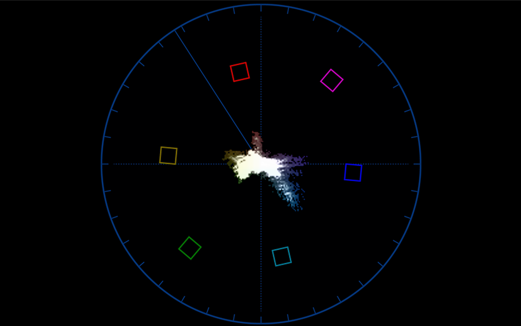
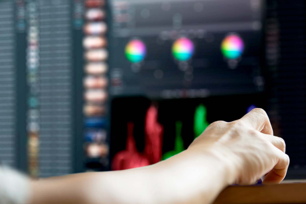
Unlike the histogram and waveform, a vectorscope is purely a display of colour. The simplest way to think of it is to picture it as a hue-and-saturation wheel much like the ones seen in grading applications, with colourless white at the centre, building up to a rainbow of completely saturated colour at the edge.
For every pixel in the image, a dot is drawn on the display at the appropriate hue and saturation. A bright red pixel representing a traffic light would appear toward the top, for instance; a picture containing a lot of green grass would show a lot of activity at the bottom right.
For complicated historical reasons, real vectorscopes tend to generate a display that's slightly rotated clockwise compared to a conventional hue-and-saturation wheel. Usually, red is directly above the centre; on a vectorscope it's at about one o'clock on the clock face. Because real-world pictures on average, tend to have fairly low saturation, with only limited amounts of powerful colour, many vectorscopes have a doubler - often marked 2X - which magnifies the image, exaggerating the saturation of the image to make small differences easier to see.
The original purpose of a vectorscope was to detect hue errors caused by distortions (phase errors) in analogue recording and transmission systems. With that purpose now almost irrelevant, the vectorscope remains useful as a way of detecting when a colour is becoming saturated to the limit of what the system can represent, or to assess hue errors which may be caused by camera or lighting problems. It is a particularly useful tool in matching critical colours such as the finish on a product or insignia of an advertiser, or in any situation where camera or lighting technique may have caused a hue rotation error.
The boxes and markings on some vectorscope displays are intended to allow test patterns to be assessed, a common practice when analogue video tape formats would begin with a thirty-second recording of colour bars. This has not been directly relevant since the dawn of digital tape formats, and while it could theoretically be used to ensure proper colour processing of material recorded in various non-Rec. 709 formats, that isn't often done.
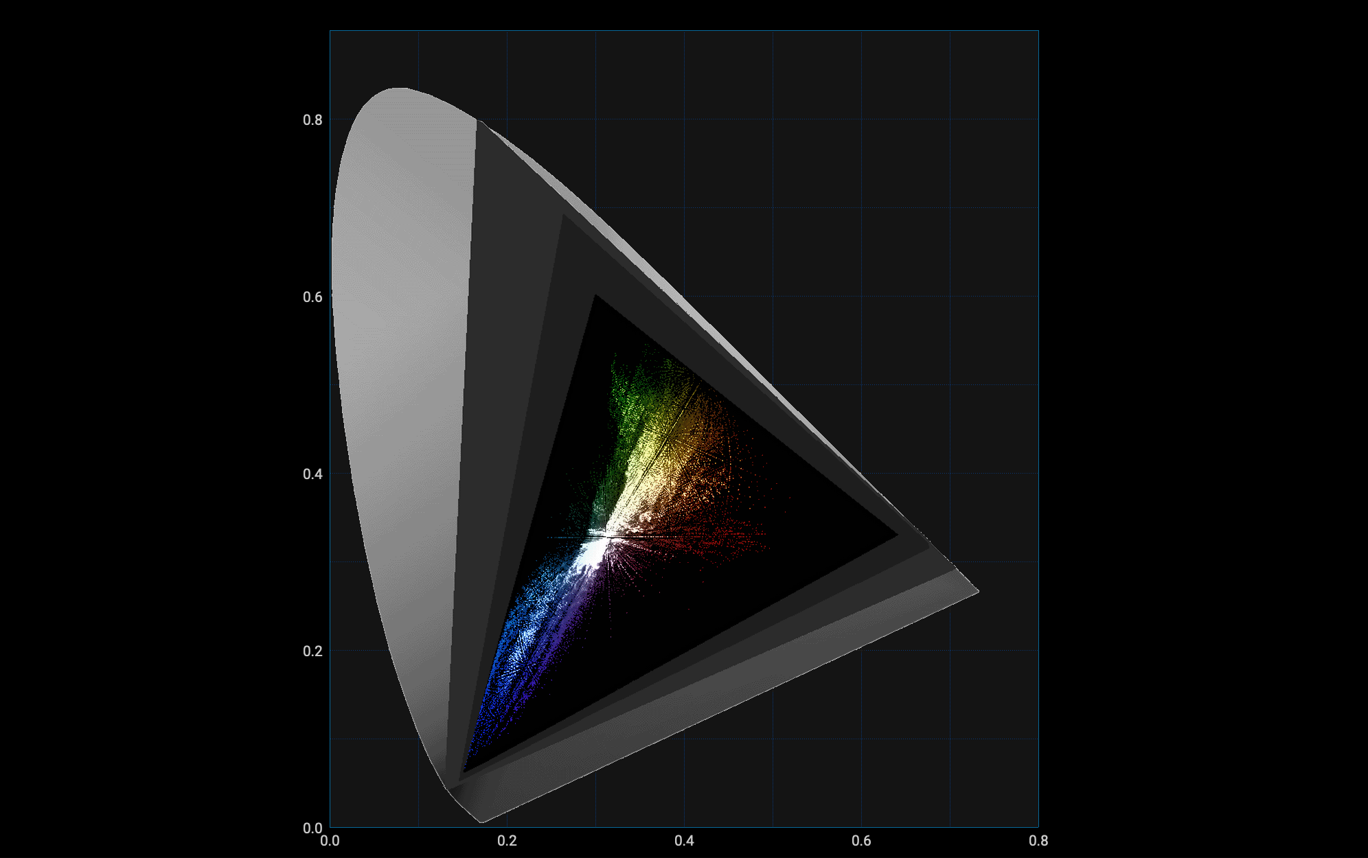
Like the vectorscope, the CIE scope shows hue and saturation, but instead of using a principally circular display, it uses the familiar CIE 1931 chromaticity diagram. The diagram is an irregular shape - a horseshoe - and red is no longer roughly at the top, but at the bottom right. The benefit of the CIE diagram is that it can represent every colour the human visual system can see, although very few digital imaging systems do and as such they're generally limited to creating colours that appear in one triangular area of the chart, limited by that system's chosen red, green and blue colour primaries.
The advantage of the CIE 1931 chromaticity diagram is that every point on it represents a single colour as detected by a human being. As such, while different productions may use different colour standards, which may be able to represent ranges of colours that cover other areas of the chart, the colour represented by a particular point on the chart is always the same - at least assuming perfect display calibration and proper system configuration in terms of LUTs and colour processing.
The CIE 1931 chart itself is, as the name suggests, more than 90 years old. As such it is not perfect, particularly in that two just noticeably different colours are separated by different distances at various points on the chart. The chart is not linear, particularly in the green, so it contains a smaller range of green colours than it would appear. Still, it's become a prevalent and commonly-used standard for lighting control, camera setup and monitoring, and even though alternatives have been developed, they haven't become as popular as the 1931 chart.
Ensuring a scope shows us something useful means understanding what we're sending it.
One common problem is a misunderstanding of signal levels. Some material may be encoded using studio swing values, from 16 to 235 in an 8-bit file. The file is theoretically capable of representing numbers between 0 and 255, and material using that whole range is often called full swing (see colour and brightness encoding).
Monitoring studio swing material on a scope or picture display expecting full swing material may give the impression that the picture has no bright whites or dark blacks, looking dull and muted and floating in the middle of a waveform display. Conversely, full swing material assumed to be studio swing may suffer crushed shadows and clipped whites, and that may not be easily recoverable. Some scopes have overlaid lines to indicate where studio and full swing material should fall, and others will scale the display appropriately.
Crucially, it's not a good idea to correct mismatched encoding using grading controls; ideally, reconfigure the tools to handle it correctly.
Similar problems can occur with vectorscopes, which might make assumptions about the colour space used by the material - that is, not just that there's red, green and blue picture information, but which red, which green, and which blue are being used (see colour and brightness encoding). These problems, and others, are solved either by setting up the software and devices involved to assume the right kind of input material, or by using LUTs
Traditionally, digital video was stored as 8-bit numbers, capable of representing values between 0 and 255 (though see 2.3.1 Signal Levels, above). As such, some scopes, particularly waveform monitors, may be numbered from 0 to 255; some may even retain that numbering when being used to display measure bit depth material. Some may change to display 0-1024 when measuring 10-bit material; others simply use 0-100% or 0-1.0.
LUTs themselves can be a source of confusion in two ways. First, if the wrong LUT is used, for instance, to view camera original material, its brightness and colour may be inaccurate. Sometimes this is very obvious, but sometimes it is dangerously subtle, affecting the intent of the camera people without necessarily looking very obviously wrong.
Another source of confusion around LUTs arises if the image visible on a display has a different LUT to the one a scope is measuring. There are standard grading techniques that involve grading either over or under a LUT, which may provoke complicated problems, and while the operation of grading software is outside the scope of this article it's as well to be aware of the potential difference between a monitor and a scope.