Get Video Editing Tips, Tricks, and Guides Straight to Your Inbox
Dark
Light
In filmmaking, colour helps set the tone and emotions and can even define the genre. Colour is as vital to setting the mood as the sound or the action on screen. Horror filmmakers use it to captivate the audience and create a flurry of emotions.
The filmmaker must appropriately apply hue, saturation, and brightness to achieve the intended effect. They also use colour correction or grading to change the colour and achieve the desired result. This post looks at how you can use colours effectively in horror films (and other genres).
Colour grading is one of the most critical aspects of creating a horror film. It's a way to make the audience feel something, whether fear, sadness or anything else. It involves adjusting the colour properties of an image to create mood, enhance the narrative, and even change the film's tone. Colour grading is the art of creatively using colour in your project.
Colour correction is the step before. It involves using digital means to enhance the original colours of the video to create consistency before you colour grade. By changing these properties, such as brightness, contrast, and saturation, you can make an image look more like what you want it to look.
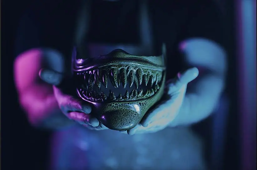
Horror movies tend to use cooler tones than other genres, such as blues, greens, instead of oranges, pinks, and yellows. The exception to those can be the use of red for moments of excessive violence. This helps create an atmosphere that's dark and foreboding and heightens viewer anticipation before something scary happens on screen.
The use of colour grading has been particularly prevalent in horror movies as a staple of the genre. Directors like George Romero (Night of the Living Dead) and John Carpenter (Halloween) helped popularize this technique by using it in their films to create an eerie atmosphere that would enhance the viewing experience for audiences.
Director Drew Goddard's hit horror film, The Cabin in the Woods, effectively uses colour grading throughout the movie. The cabin was very dark, with red lights that gave off a creepy, ominous feeling whenever someone entered or left it. The rest of the film takes place outside during daylight hours, which makes it seem even more unsettling because there is no explanation as to why everything looks so gloomy at all times.
An excellent example of colour correction in horror movies is when the director uses a dark look by lowering the brightness in post-production. This creates an eerie atmosphere for viewers watching from home with their lights off. The director may also play with the contrast of the image, in which case they use high contrast to make bright areas even brighter and dark areas even darker, so there is no middle ground between them.
When creating a horror film, you may use saturation to add or remove colour from images. For example, some horror films use desaturated images so that all colours are less vibrant and appear washed out (think The Blair Witch Project). This technique makes it seem like the world has been drained of life and colour, which can be very disturbing for viewers.
Adding or removing texture from images also helps you achieve a specific feeling. For example, in The Blair Witch Project, the director uses grainy film stock that creates a rough texture on screen. This technique makes it seem like what you're watching is 'real footage' rather than a Hollywood production, which can increase its realism and make it feel more terrifying. Although shooting on film stock is expensive, there are ways you can add this effect digitally in the edit if you want to achieve it yourself.
The most commonly used colours in horror films are black, blue, green, red, and white. The use of colour in films is stylistic and evokes an emotional reaction from the viewers.
Red is often associated with anger or passion. This can be seen in films like The Shining (1980), where there's a lot of red carpeting and red blood on walls and floors. Black symbolizes death and darkness, which makes sense since most horror movies happen at night or involve ghosts or monsters that can't be seen during the day.
Blue is also used in horror films because it makes people feel uneasy. This feeling may have to do with the fact that blue is associated with coldness and even death. In many cultures, blue has long been seen as the colour of mourning or sadness.
Green is also often used in horror films because certain tones or shades are considered one of the least attractive colours. This makes green an ideal choice for creating a sense of disgust or revulsion in viewers, making them think twice about what they're watching on screen. White is often used for contrast, like when someone tries to scare another person by wearing a white mask covering their entire face except for their eyes, making the darkness of the eye holes more prevalent.
As an aspiring filmmaker, there's a lot you can learn from the horror films mentioned in this post.
The Cabin in the Woods film teaches you not to be afraid of experimenting with your work, especially if you're starting as an editor or colourist. In the movie, Goddard tries different things with his shots while filming, like using a lot of flares and reflections on his actors' faces so they look older than they are. These experiments can help you feel more confident as you try new things in your work.
In The Blair Witch Project, Eduardo Sanchez and Daniel Myrick used several techniques to create suspense in their films. They create an eerie atmosphere with smoke machines and shadows on the wall with green light coming through a window while filming actors in dark rooms or places where it is hard to see anything outside from inside the room.
This film is influential because it understands what makes people scared as opposed to what they want to see in a movie. It tells a story instead of just showing people being scared, making it more believable than other films where people get killed repeatedly without any real reason.
Colour can give your film a unique look and feel. The right combination of colours can help you create an exciting world for viewers to experience. Colour is one of the most distinctive elements of the film; it's also one of the easiest things to mess up when editing video footage or colouring still photos. Learning how to use it effectively helps tell the story of your film.