Get Video Editing Tips, Tricks, and Guides Straight to Your Inbox
Not everything can be fixed in post-production, but some things can be, like the colour. To make sure your footage has the right feel and look to it, you need to know the necessary tricks and skills of color grading. Every piece of footage in a production goes through both colour grading and colour correction which are, in fact, two very different things. Here is everything you need to know about coloring.
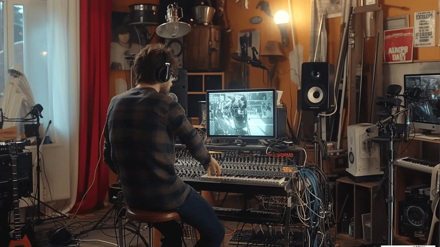
After a long day of shooting, you finally sit down to edit your footage and notice that your footage looks different from one shot to another. Does this sound familiar? Don't worry - there is a lot you can do with colours. Before we look closely at the difference between colour correction and colour grading, there are few important terms and concepts that every would-be colourist should be aware of.
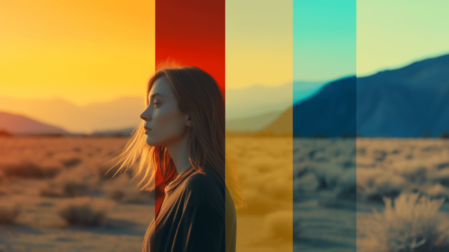
When editing the colours of your video, you see three primary colours of light: red, green and blue - also known as “RGB” colours. Combining these three colours, you can produce different hues. For example, adding blue to red creates purple or red to green creates yellow. As a video editor things like hue, saturation, and luminance can drastically improve your footage when done right.
Hue is the “pure colour”. Colorists that talk about colours like red, blue or green are speaking about its hue.
Saturation is the intensity of the colour. This is determined by the amount of grey that is in the colour; for example pure grey (no saturation) to more less grey (high saturation).
Luminance (brightness, lightness) is the level of light in your colour. Black has a very low luminance and white has a very high luminance.This separates the difference between, let’s say, pitch black versus dark grey.
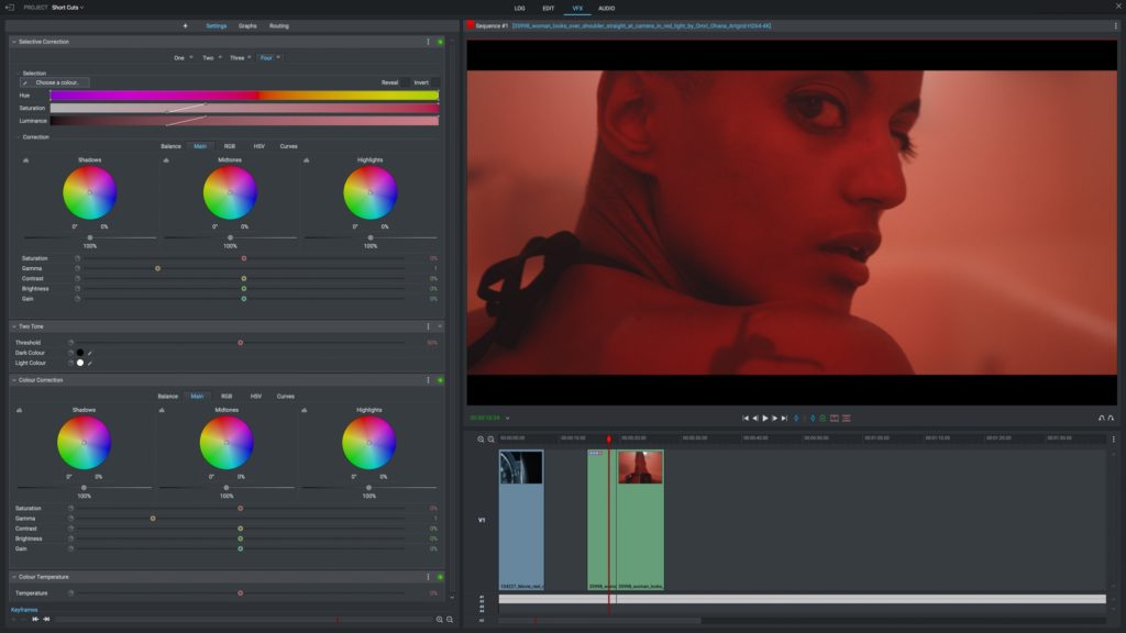
Most color grading and colour correction tools include “HSL” sliders for that. Color grading in Lightworks uses colour wheels. These are the most basic color correction tools. They represent the colour controls on a physical control surface, which you can use to adjust colour in a 2D space.
Colour correction is the first step in the colour grading workflow and every colourist needs to do this before grading. Colour correction provides visual consistency, where balancing and evening the colours is everything. This is a highly technical job, but it can save a scene from having compromised lighting or unbalanced colours, to ensure the end result is exactly as intended.
Sometimes when filming outside, days might get long and filming the same scene over and over might look different depending on the time of the day. Or, in some cases actors might not be standing in the right spot for the correct lighting. Colour correction makes sure the scenes remain consistent to the purpose of the scene. Colourists creatively add a look or a mood to the footage to suit the story being told. Here is what you need to do:
STEP 1: PROFILE
Make sure your software knows what kind of video you are working on. Working with a specific format that applies the same colour profile to prevent any strange and unexpected results.
STEP 2: EXPOSURE
To really start colour correction, you need to make sure you're setting your exposure correctly. This comes down to proper brightness (luminance). This can be assessed by the exposure from peoples faces. If you nail this, you are usually close to getting it right.
STEP 3: WHITES
Before you start correcting the colour make sure you have a proper balance with your whites. You can think white as a white canvas; when this is right, all the other colors fall in their right places. If your white is too orange or blue, it tints your other colors off as well. But this can also be used creatively to add mood to a scene.
STEP 4: CONTRAST
Contrast sets the difference between darks and brights. The more you add contrast, the more your image appears sharper and detailed. Less contrast appears more foggy and less defined.
After you are happy with colour correction, it’s time to take step further with color grading. Don’t get me wrong - this is also a highly technical process, but it allows you to get creative and set the right visual tone to the scenes. By manipulating the colours, you can create more engaging footage to achieve a specific atmosphere that attracts your viewers. I like to compare it to the audio effects, where adding dramatic music makes all the difference compared to a scene with no music at all.
Compared to colour correction, colour grading uses the software to create visual characteristics that help to tell the story. This is done by making both technical and creative adjustments to ensure the footage closely follows the colour palette that is unique to the style and emotion of the movie. So, make sure you choose the right palette that reflects the mood you want to express to your audience.
We have all grown to associate different colours with different emotions. When thinking of cold or cool, we usually associate it with blue tones. The same goes with warm and hot. We think of red and orange, highly saturated tones and bright colours that represent daytime for us. Here are colours and their associations that have been used in some Hollywood classics:
The Wolf of Wall Street, LA Confidential, Pulp Fiction, Heat, Hugo, The King's Speech, and many more Hollywood films have used Lightworks for post-production, which means Lightworks has what it takes to reach the industry standards. Do not mistake this as “only for professional use”, because Lightworks has everything for everyone.
Our colour grading editing features range from basic to advanced ones. Useful tools like shadows, highlights, contrast, saturation, and other colour effects are really great for beginners who are still understanding the concepts of editing. The professionals can use its colour grading tools seamlessly for professional results.